It might seem like the new year is all about new goals and new looks. But January 1st isn’t just about hitting unbelievably busy gyms, jumpstarting better finances, or disavowing leftover holiday treats.
On a deeper level, the new year symbolizes evolution – embracing the changes that need to be made, yes, and honoring the past that got us there. It’s about thanking old habits, friends, and decisions, even as we let them go.
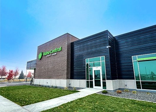
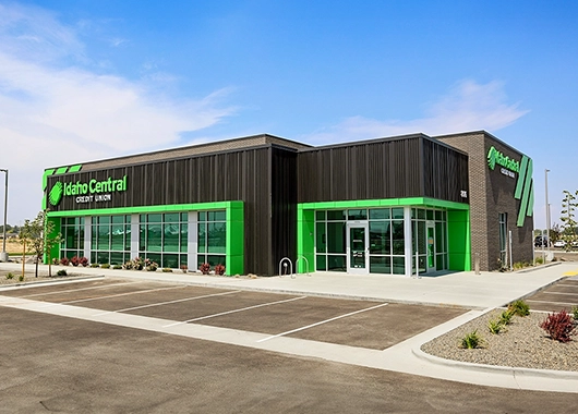
In that spirit, we’re unveiling the new ICCU logo. As our membership evolves, so do we, growing to better serve the people and communities we steward. Even so, our mission, helping members achieve financial success, forever roots us.
Catch a sneak peek of our new logo and check out all our old looks. As you do, you’ll see that while our name and look have changed over the last 85 years, the core of what ICCU represents will always stay the same.
2025: The Newest ICCU Logo
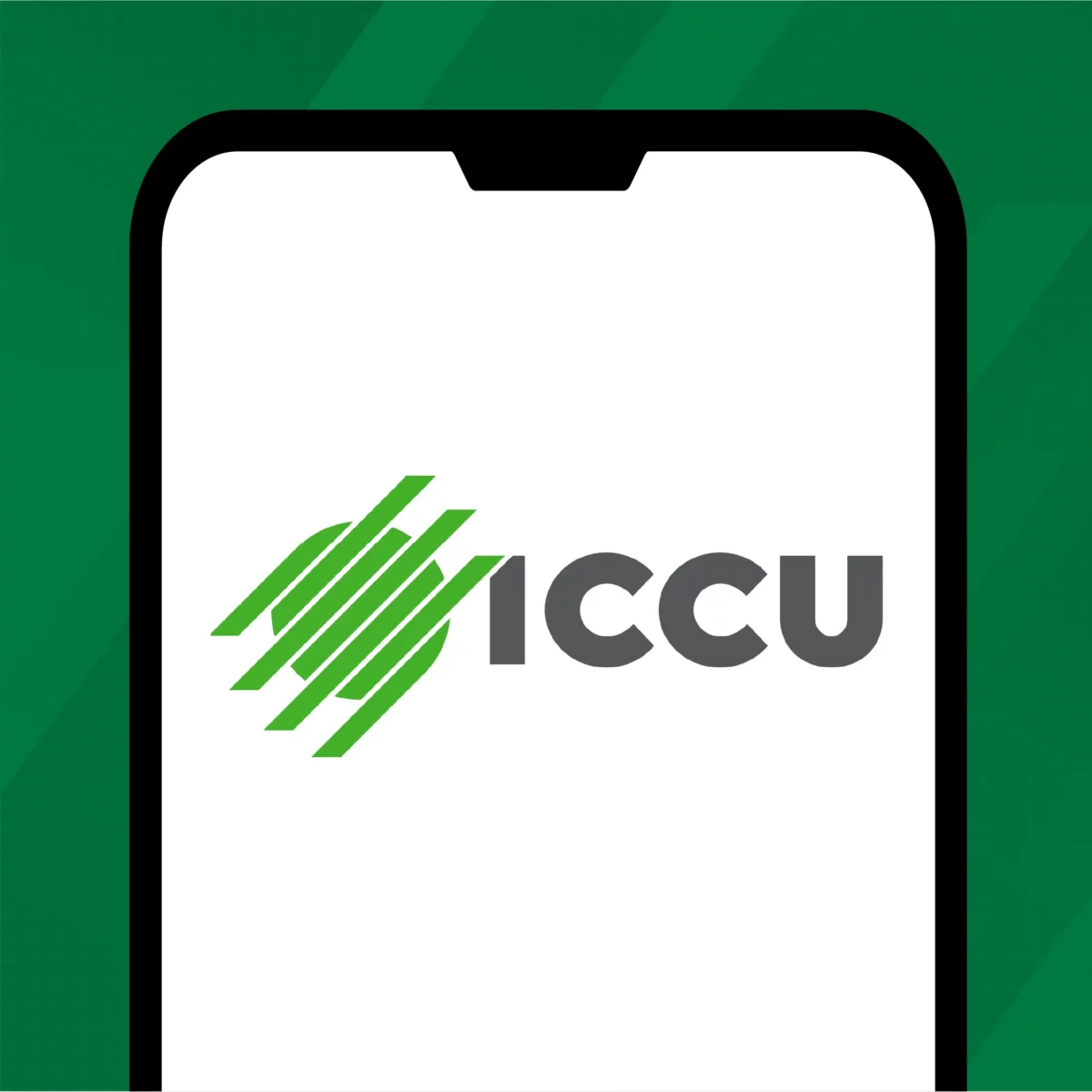
2025 is a year of new horizons for our members, both literally and figuratively. Over the coming months, we’re expanding to Tri-Cities in Washington and Tucson, Arizona. To represent these new members and pay homage to our existing ones, our logo is evolving to what people already know and love us as: ICCU.
You may also notice that we’ve simplified our logomark (the ball of diagonals on the left) to 7 lines rather than 11. We found that fewer diagonals streamlined the look and feel of the logo while keeping its meaning intact.
Finally, we changed the logo’s colors to include not only our primary green but our sleek grey as well. Our green-and-grey color palette, which we’ve used in marketing materials for several decades now, exudes confidence, stability, professionalism, and abundance. By showcasing that in our new logo, we stand behind those values.
1940: The First ICCU Logo

Believe it or not, this was ICCU’s logo for over 60 years. Though it doesn’t look much like the logo we use today, it still has one similar element — our logomark. That’s because the logomark symbolizes the very thing we as a credit union strive for: success through unity.
The diagonals on the left represent the credit union, while the ones on the right represent our communities. When united, the diagonals become a greater whole, something bigger and better than what they were on their own.
2003
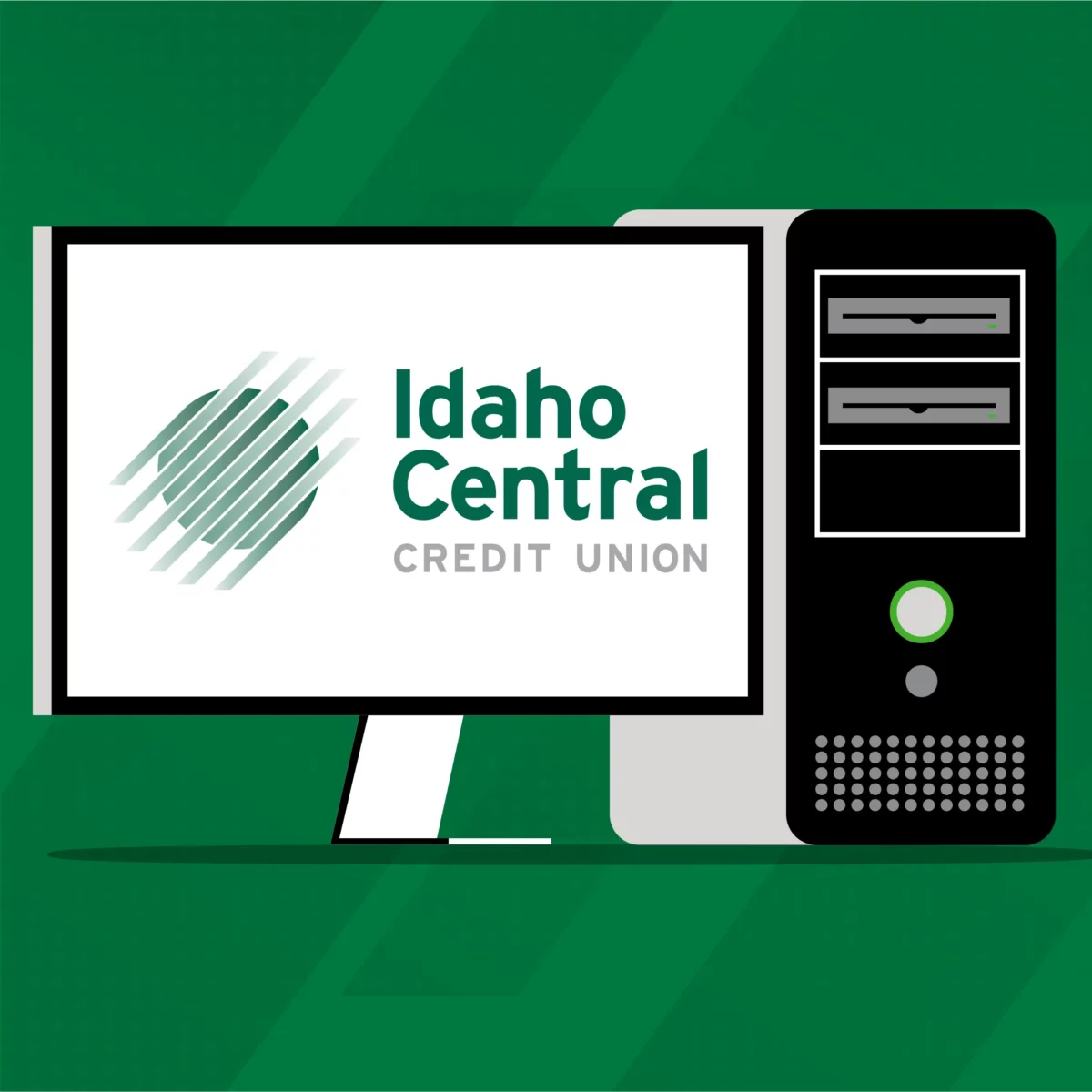
When we rebranded in 2003, we changed the direction of the diagonals so they moved forward and upwards, just like us. The diagonals also pointed toward the phrase, “Idaho Central,” which reinforced the reason we were there: to act as a central hub for our members, which at the time only included residents of Idaho.
We tweaked our primary color and typeface to better depict our personality — friendly, approachable, and forward-thinking.
2014

This is the logo most people know us by, and we’ll admit, it’s one of our favorites, too. We traded the dark green gradient for the sleek kelly green members love us for today. Throughout the last decade, this logo has become an emblem of ICCU’s vibrant spirit, joining us in countless parades, on our Green Machines and jeeps, and at every event we’ve had the pleasure of supporting.
Yet as our members evolve, so do we. We’re thrilled to kickstart 2025 with not only a new style, but a new vision for the future. We’re here to help you thrive, and we know these changes will enable us do just that.
No matter how we look or where we go, you can rest easy knowing we’re still the same ICCU — here year after year, helping you achieve financial success.
